1965 e 43rd ave
vancouver, bc
Much has changed in Vancouver, but the building at 1965 E 43rd Avenue has seen continuous use since 1965. Its brown, 1” square tiles have endured. Its stucco has been repainted many times - the current coat, in good light, could be described as guacamole green. The paint is punctuated at irregular intervals by repaired cracks and ad-hoc rainwater leaders winding across the facade.
Many Vancouverites are familiar with these textures. They typically precede the demolition, destruction, and erasure of such edifices from our collective memory. Perhaps not particularly remarkable in the memory of Victoria Street residents and shop-owners, the building has none-the-less served as a faithful backdrop to essential activities - it currently serves two ground-level grocers and 6 residential tenants on the second level. The owner appreciates the culture around his building and has positive relationships with his tenants. Like them, he would like to minimize disruption to his well-rooted life in Vancouver.
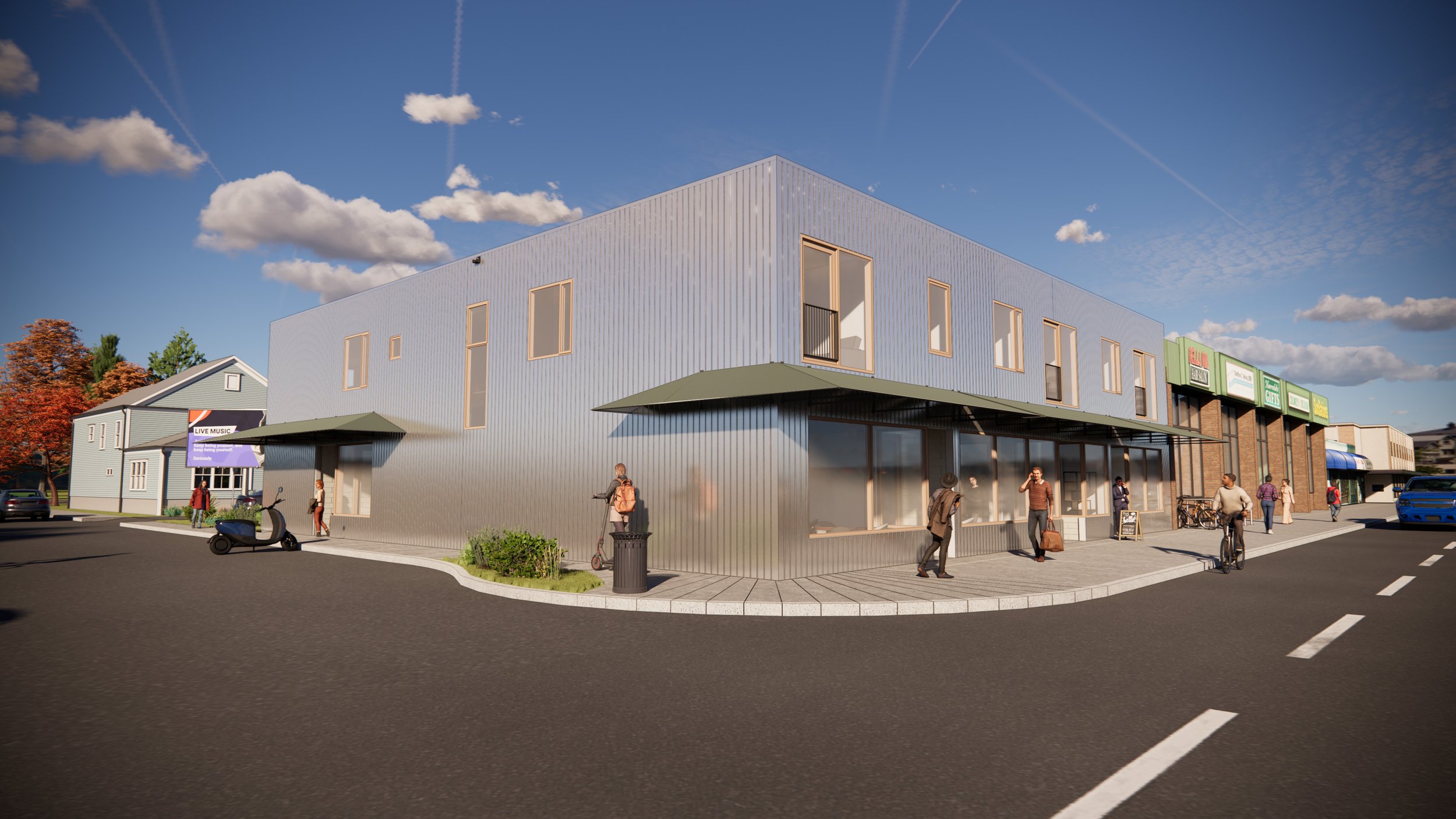
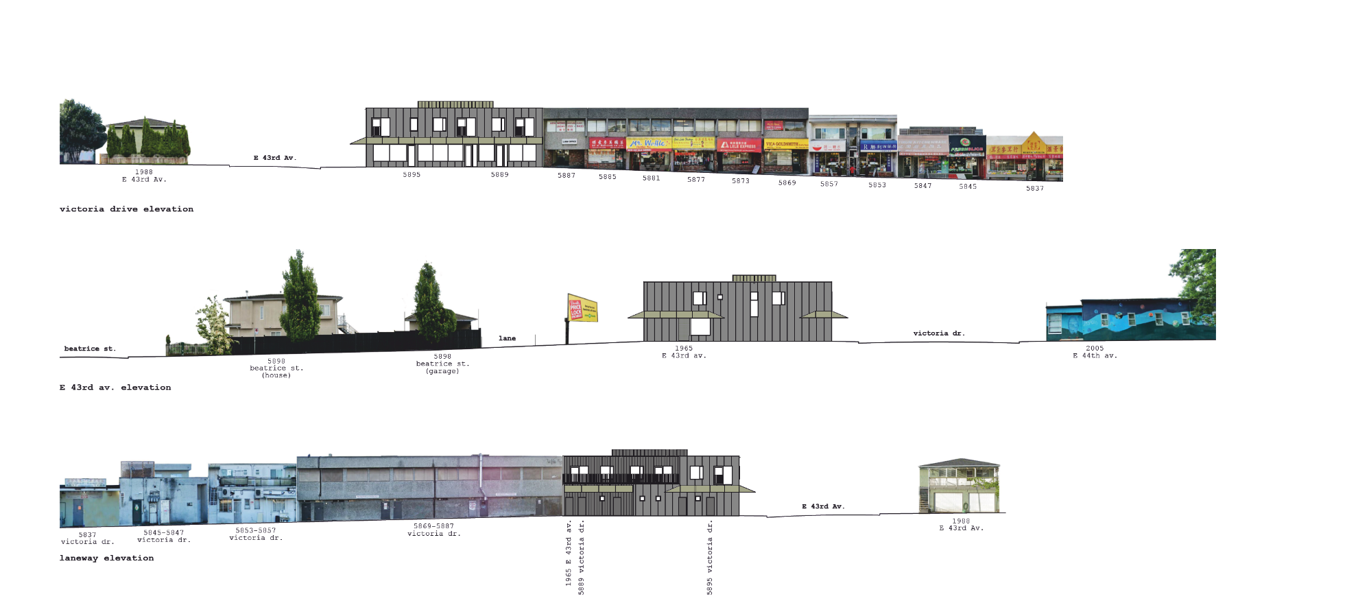
However, the building must be overhauled if it is to continue to serve its community. The architectural concept is a practical recipe of adaptive reuse - how can we make the most of the existing building through new technologies and minimal adjustment of building form? Our response is to highlight the simplicity of the original building, while improving the inhabitants’ experience by thoroughly activating existing spaces and interior-exterior connections. Simplicity of building form is reinforced by replacing failing stucco with consistent, bottom-to-top, vertical corrugated steel cladding on all perimeter walls. The material was chosen for its durability, recyclability, and non-toxic nature.
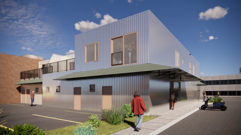
Where the otherwise rectilinear building form is recessed, 12”-wide flat panels are used as cladding and the perimeter walls project 3” beyond the cladding change, giving the impression that the building is revealing its core. These areas include CRU access and a second-level patio space. The patio makes use of an existing second-level roof space to provide additional exterior amenity for two units, creating unit variety, connection between neighbours, and increasing usable space. CRU access and L2 patios are less public and therefore, in program as well as form, the recessed areas express the core of the building’s function.
This concept of “simple exterior, lively interior” is brought inside the residential units by applying it to the cabinets at a smaller scale. The design consolidates cabinets into a larger, more functional, but spatially efficient kitchen, integrating heating and cooling fans, cooking, and study spaces. Where the rectangular forms of the central cabinet blocks are drawn back, open plywood shelving reveals a warmer core to the cabinets, bringing life and colour to the apartments, curated by inhabitants. New windows offer the opportunity to increase connectivity between the upstairs units and the neighbourhood. This is done through Juliet balconies, offering natural airflow on warmer days, daylighting, expansive views of the neighbourhood, and expressing the lively apartment interiors of every unit.
designed by f2a architecture ltd.
in-progress
Privacy for apartments fronting Victoria Street as well as rain and sun protection to the renovated storefront below is accomplished with a formally minimal version of the commonplace vinyl awning. The awnings provide ample but economical shade and rain cover - with sharp form contrasting with the building’s rectilinear massing. All elements harmonize in texture and colour. The smaller details bring the most exquisite textures: privacy screens are of perforated cladding panels. Small ceramic tiles will clad entry recesses, referencing 1965 textures and rendering the most-frequented public spaces tactile.
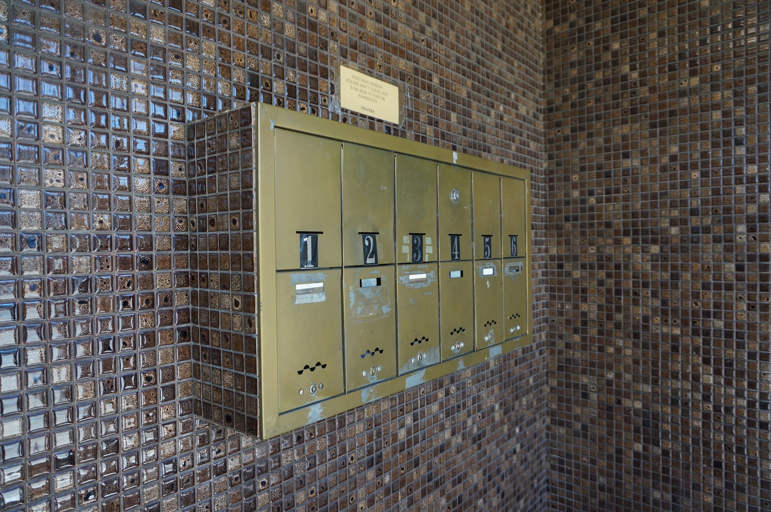
The original brass mailbox will be reused as a primary feature in the residential entry lobby. This mailbox, though potentially antiquated by electronic communication, brings a texture and personal connection to the common space of the building. Cemented in place, it says in spite of our fast-changing world, we will share space just as we have since 1965, and that experience will continue to be lustrous.


